Hey there, I’m Raina
I’m a designer that thrives in collaboration, excels in creative thinking and visual problem solving, and is inspired by the Mid-Level Graphic Design position you have available at EDG Design.
I’ve put together this collection of work specifically in response to what you’re looking for: brand design, signage and experience design, and creative strategy. If you’d like to see more (or something specific), please reach out. I’d be happy to provide whatever you need to discover that I am a strong candidate, eager and excited to join your team: meet.raina.wang@gmail.com
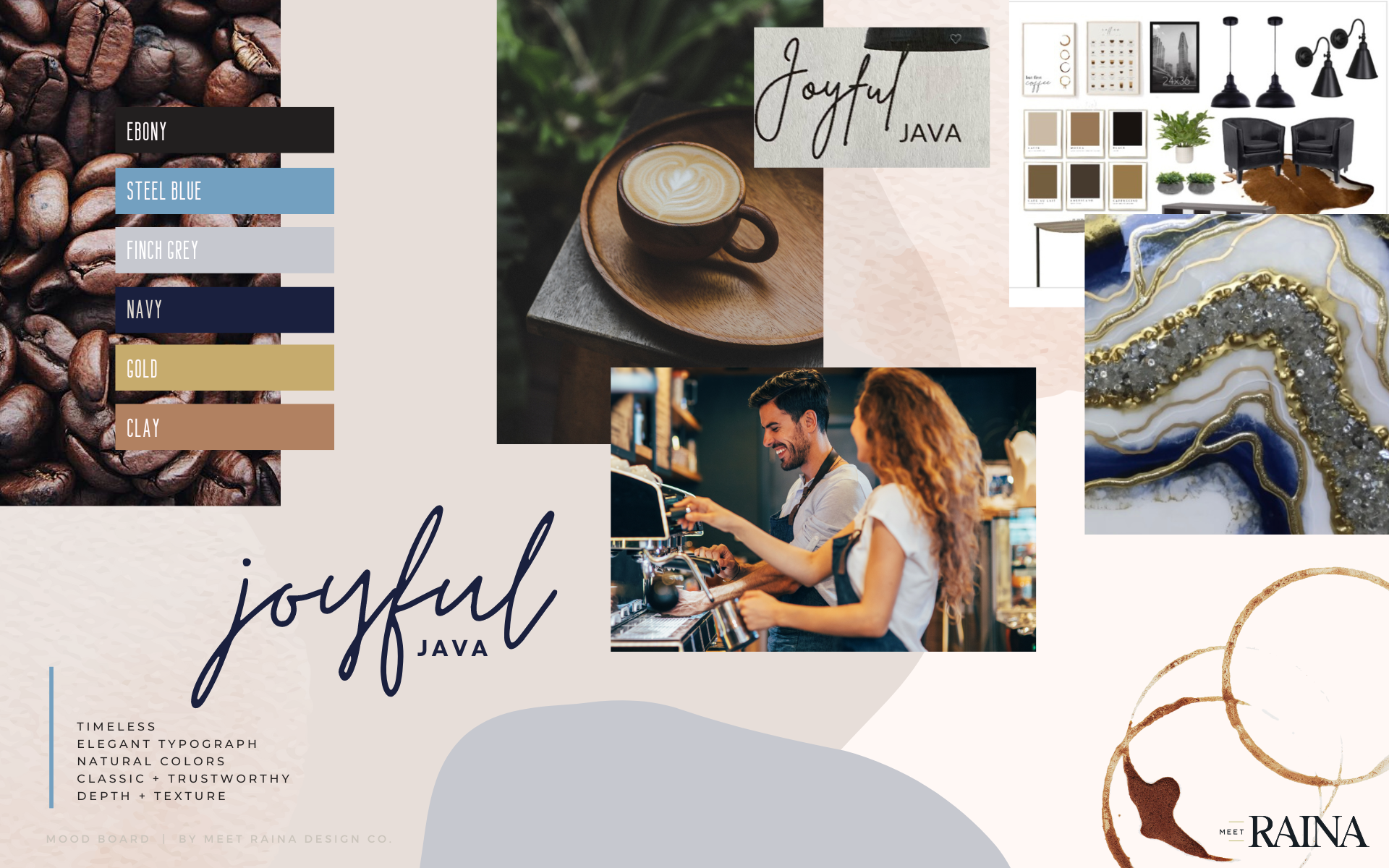
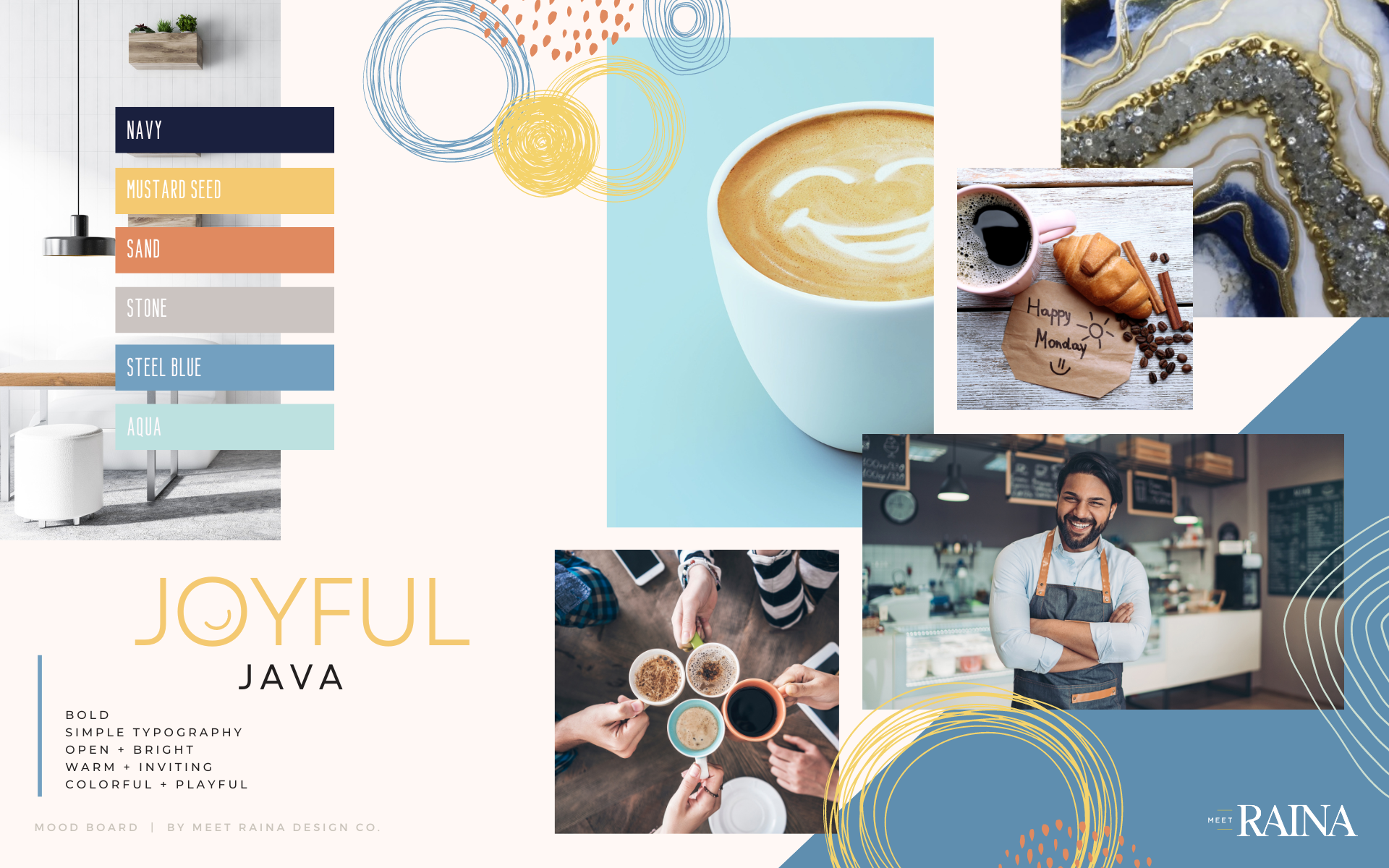
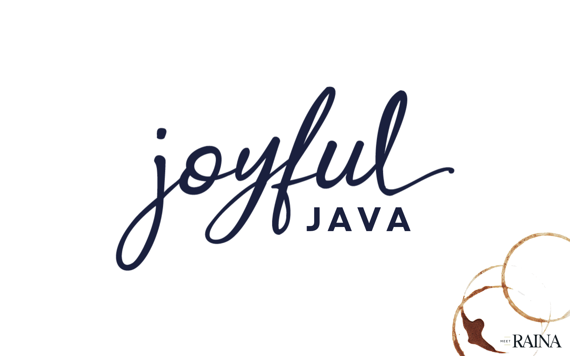
Joyful Java / Coffee Shop Grand Opening
/ PHASE 1 /
We started the branding for this local coffee shop with 2 completely different directions: warm, modern, and classic; or playful, colorful and… well, joyful. While I adored the playful direction, we went with the more timeless coffee-shop look.
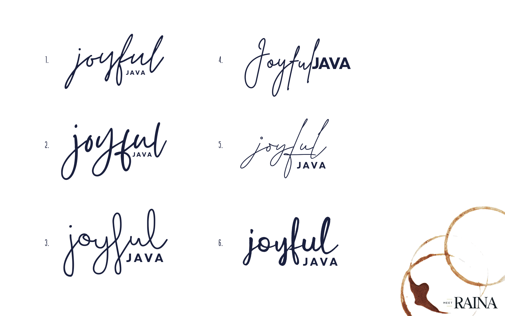
/ PHASE 2 /
After we narrowed down our focus, we tried a few different scripts to try as the base of our font. From there, we modified the logo until it had a joyful, friendly vibe that still fit our timeless mood.
/ PHASE 3 /
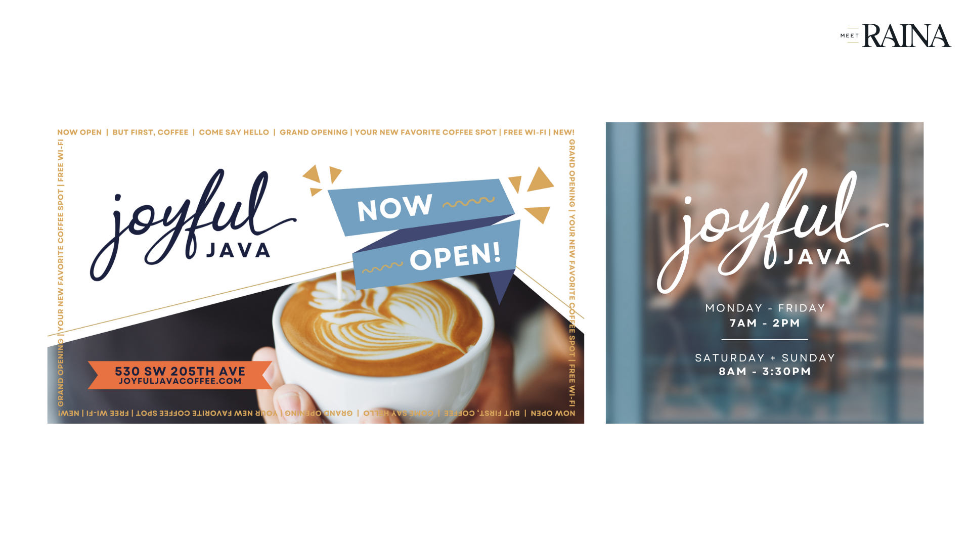
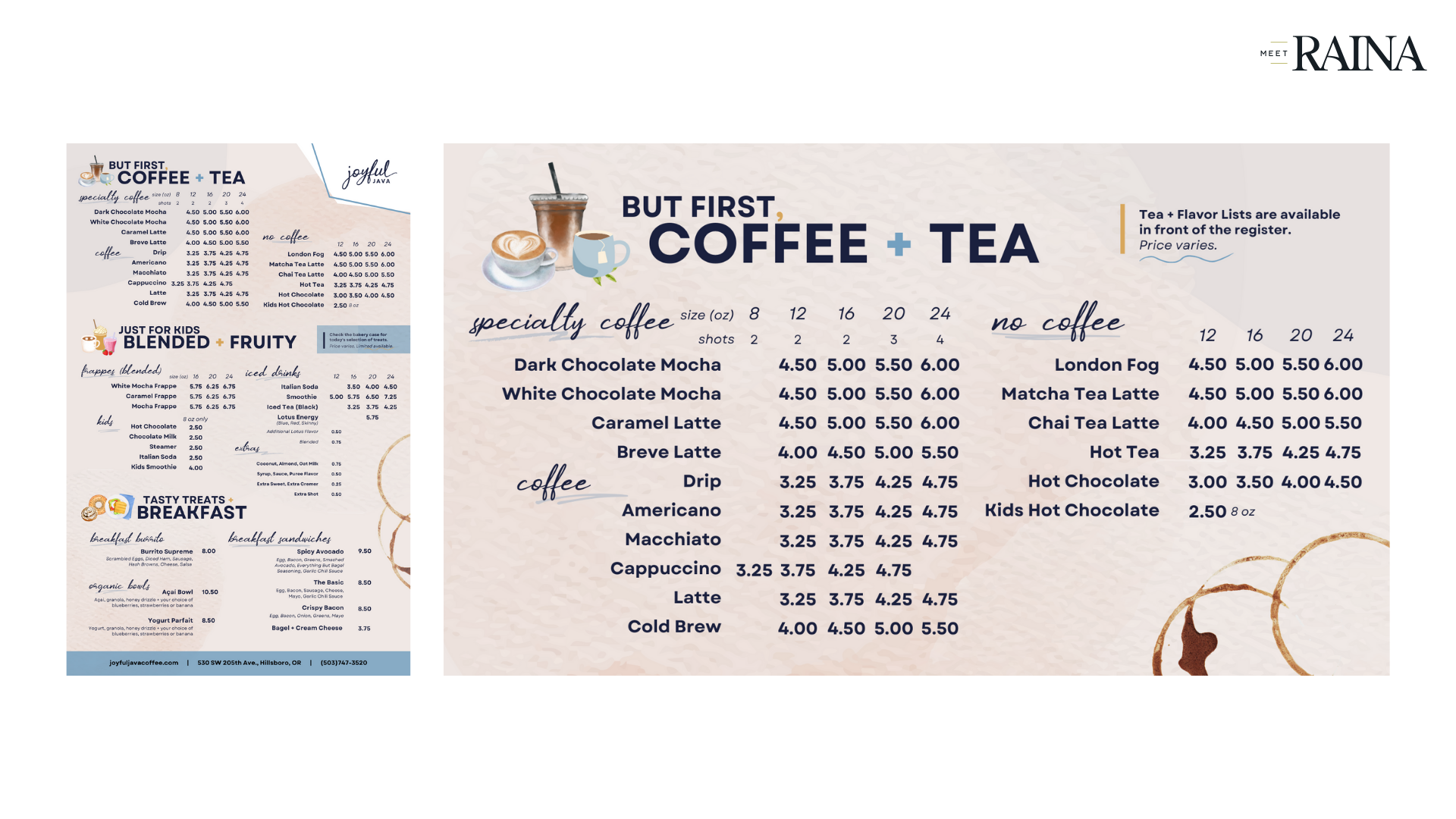
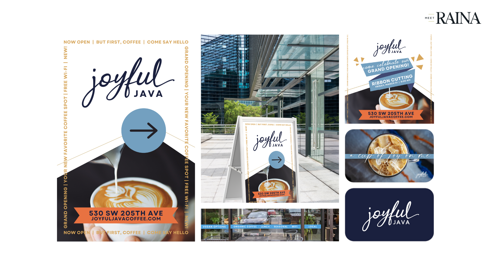
Once the logo and brand were defined, we created a slew of launch graphics for both print and digital to announce and celebrate their opening, as well as their menu boards, window clings, and gift cards.
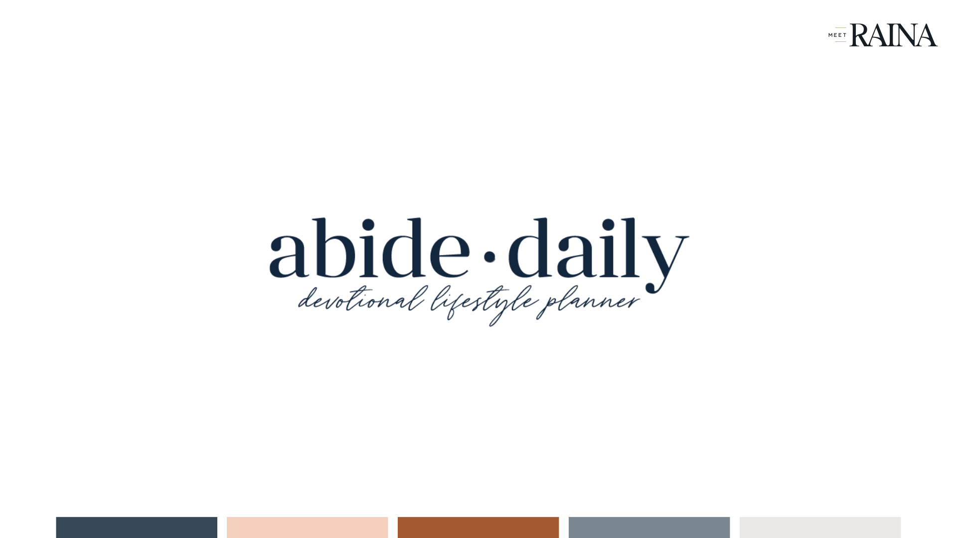
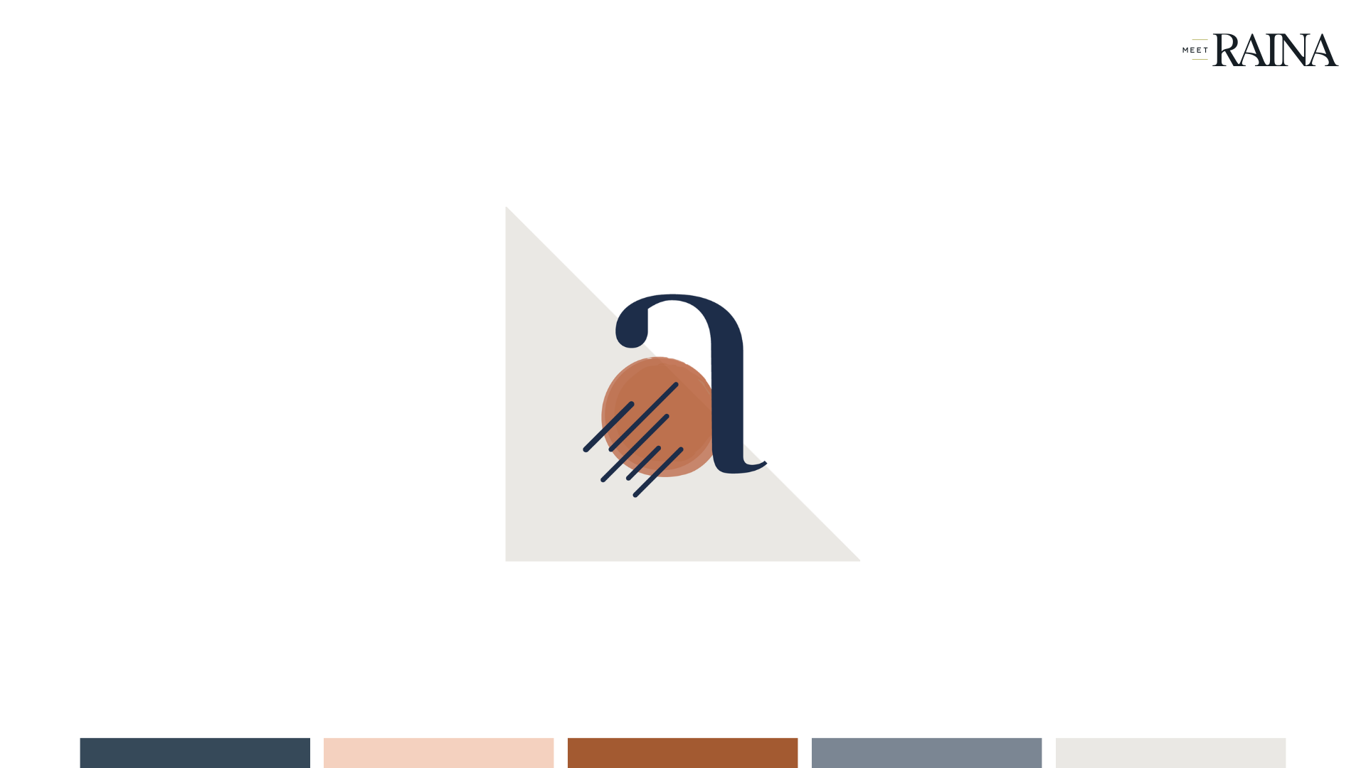
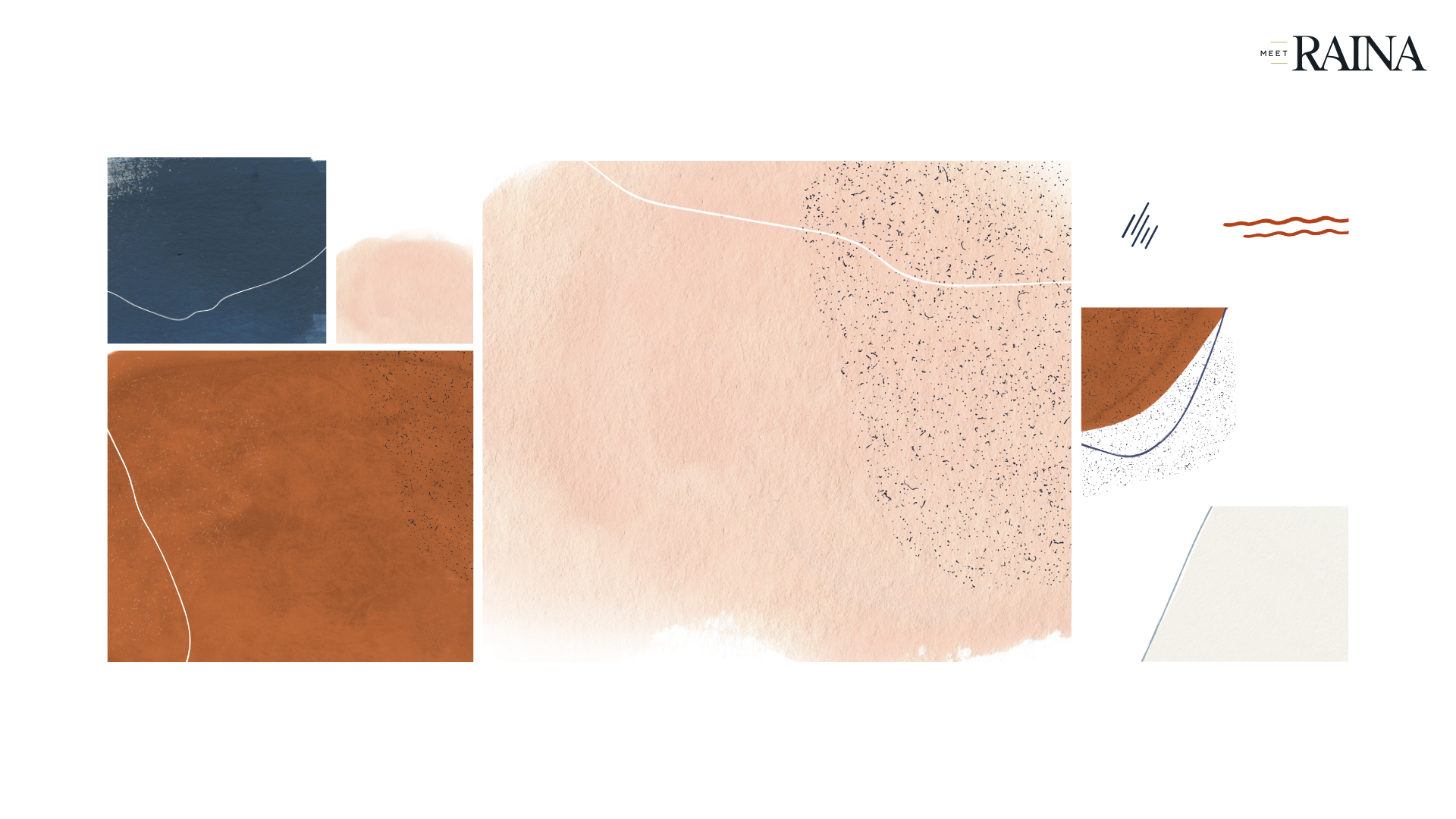
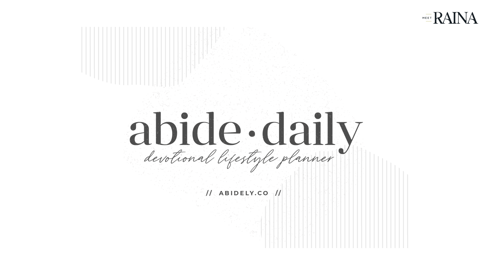
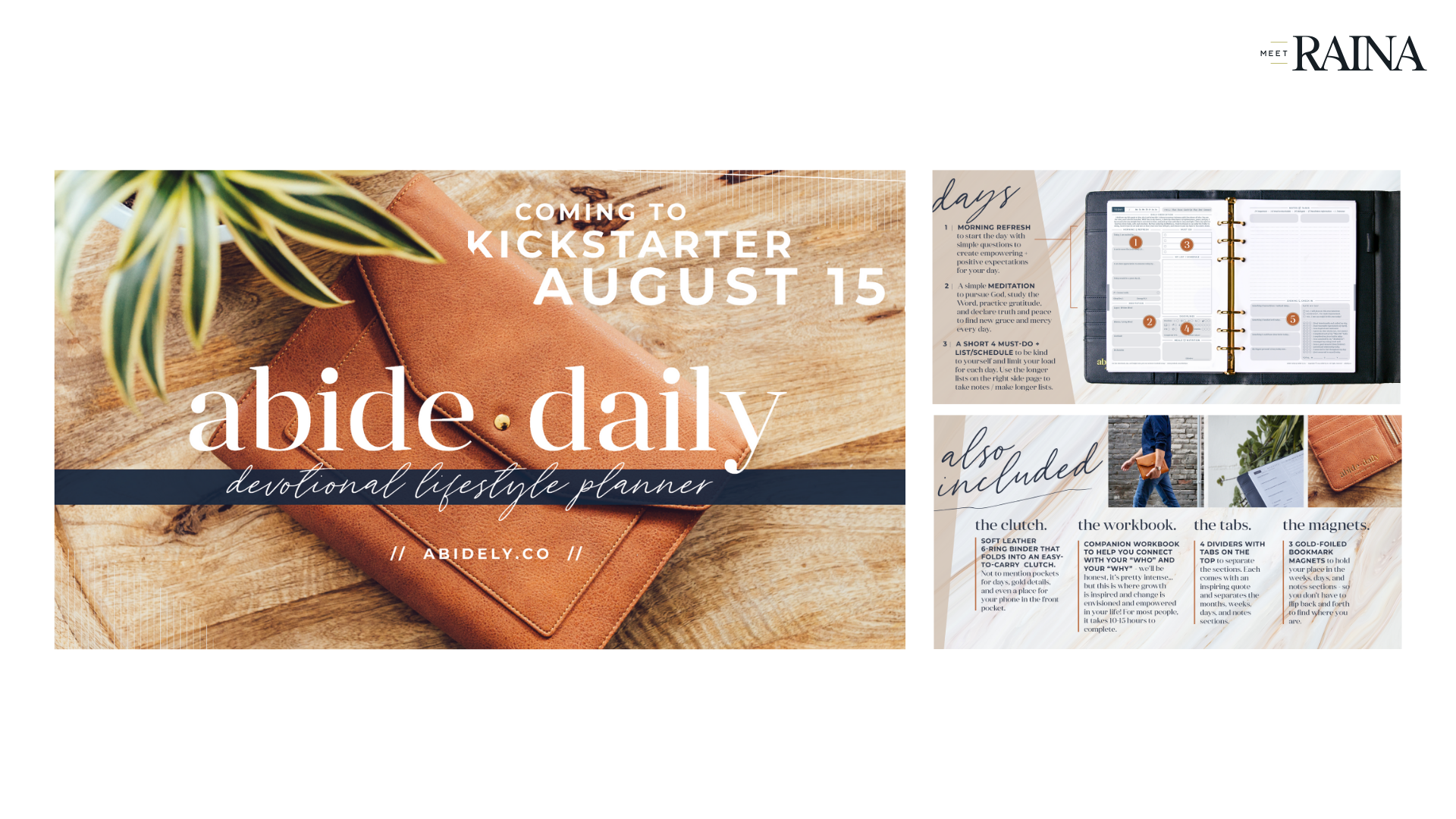
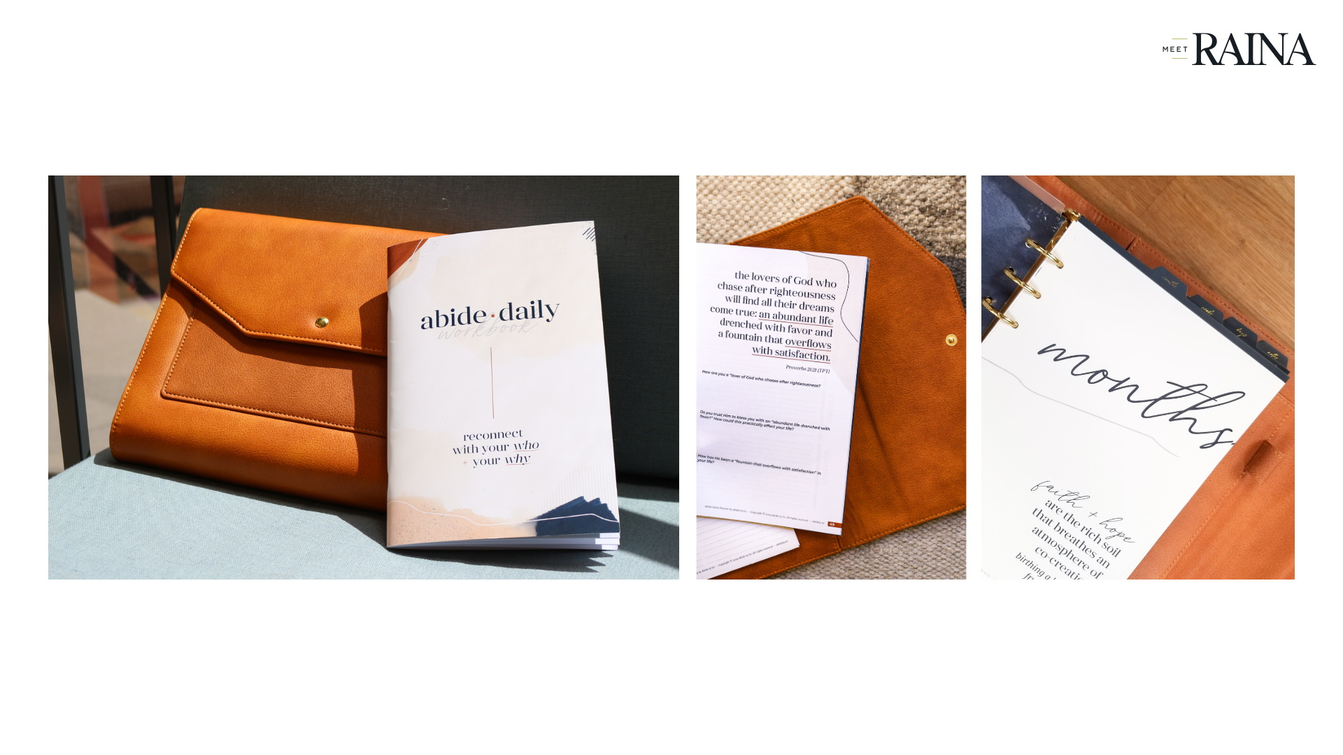
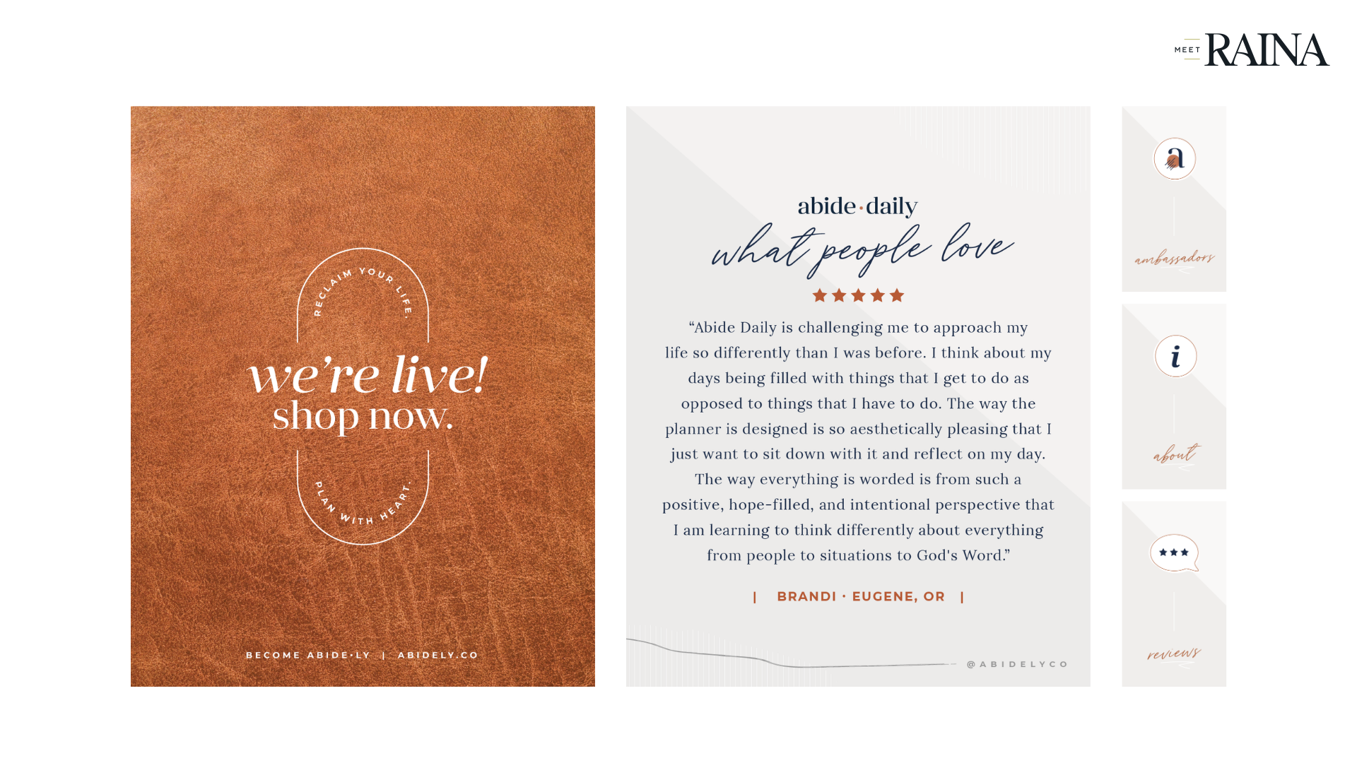
Abide·ly Co / Kickstarter Campaign
/ PHASE 1 /
I created the branding for the Abide·Daily Planner in preparation for a Kickstarter campaign. The brand was designed to be feminine while not excluding masculinity, rich with neutrals but no strong accent colors, with organic textures and cheerful typography.
/ PHASE 2 /
I created all of the launch graphics, the Kickstarter campaign page, and over 100 social posts to support the campaign. I also art-directed the promo video and photoshoots, provided all supporting graphics, and took the majority of the photos of the product once it was produced. Not to mention… I designed, wrote, and produced the product itself.
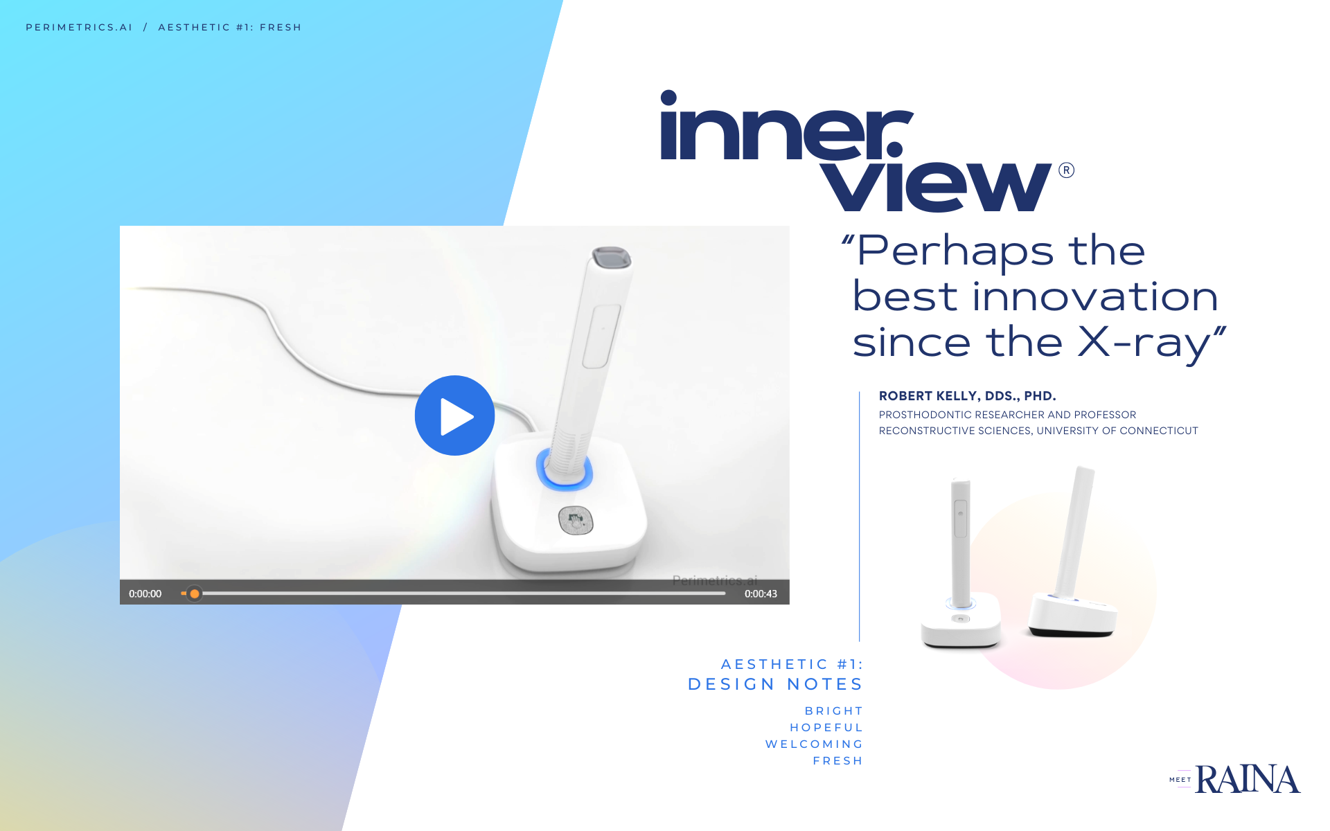
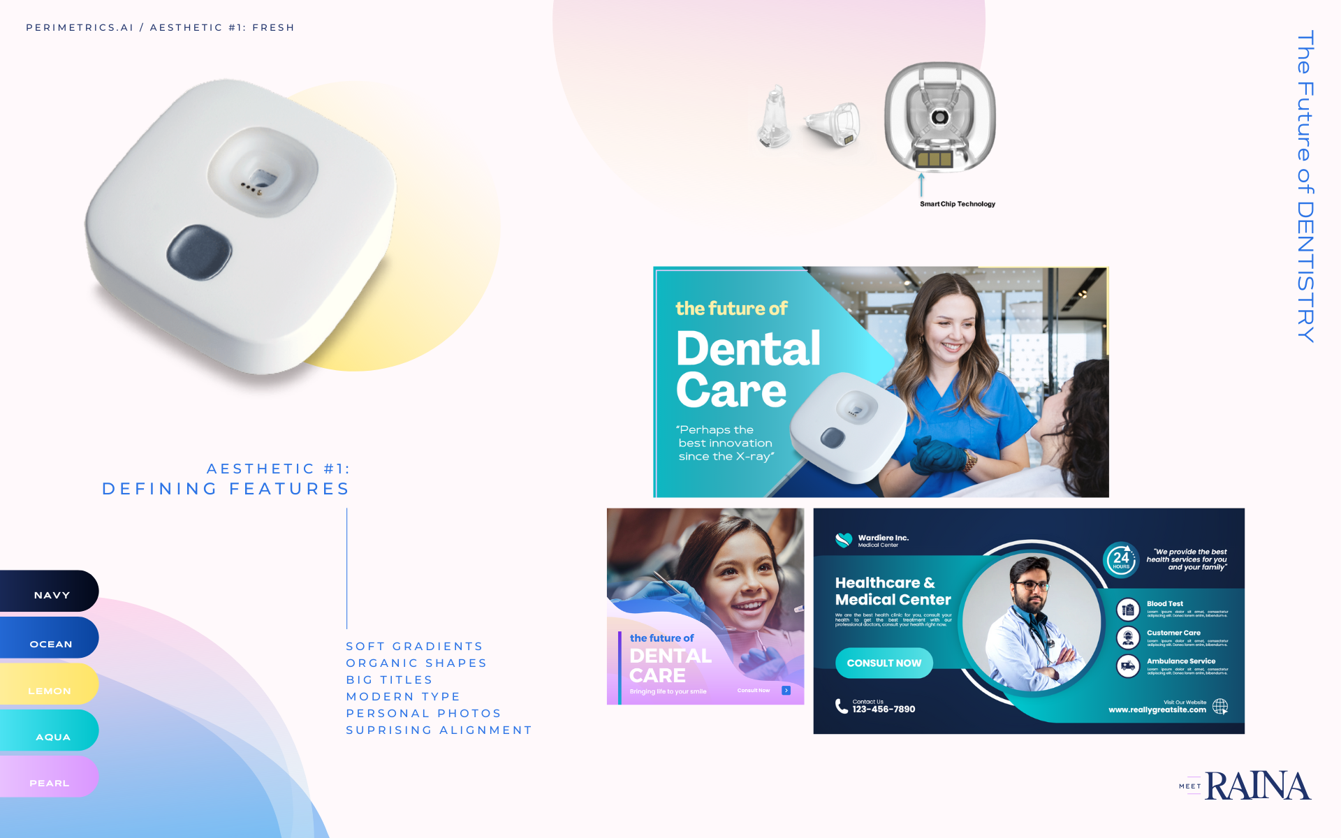
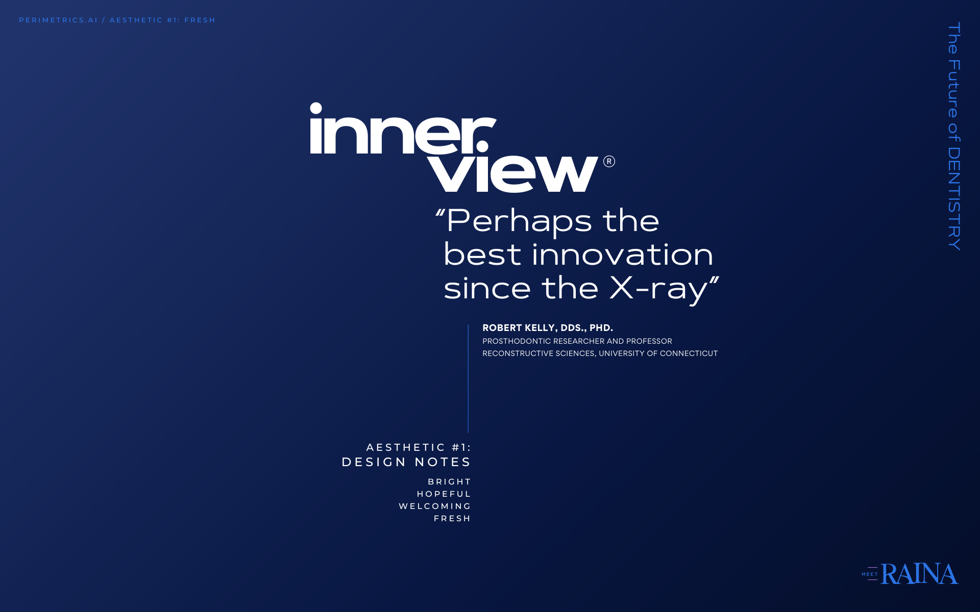
InnerView by Perimetrics.ai / Brand Discovery
/ PROJECT OVERVIEW /
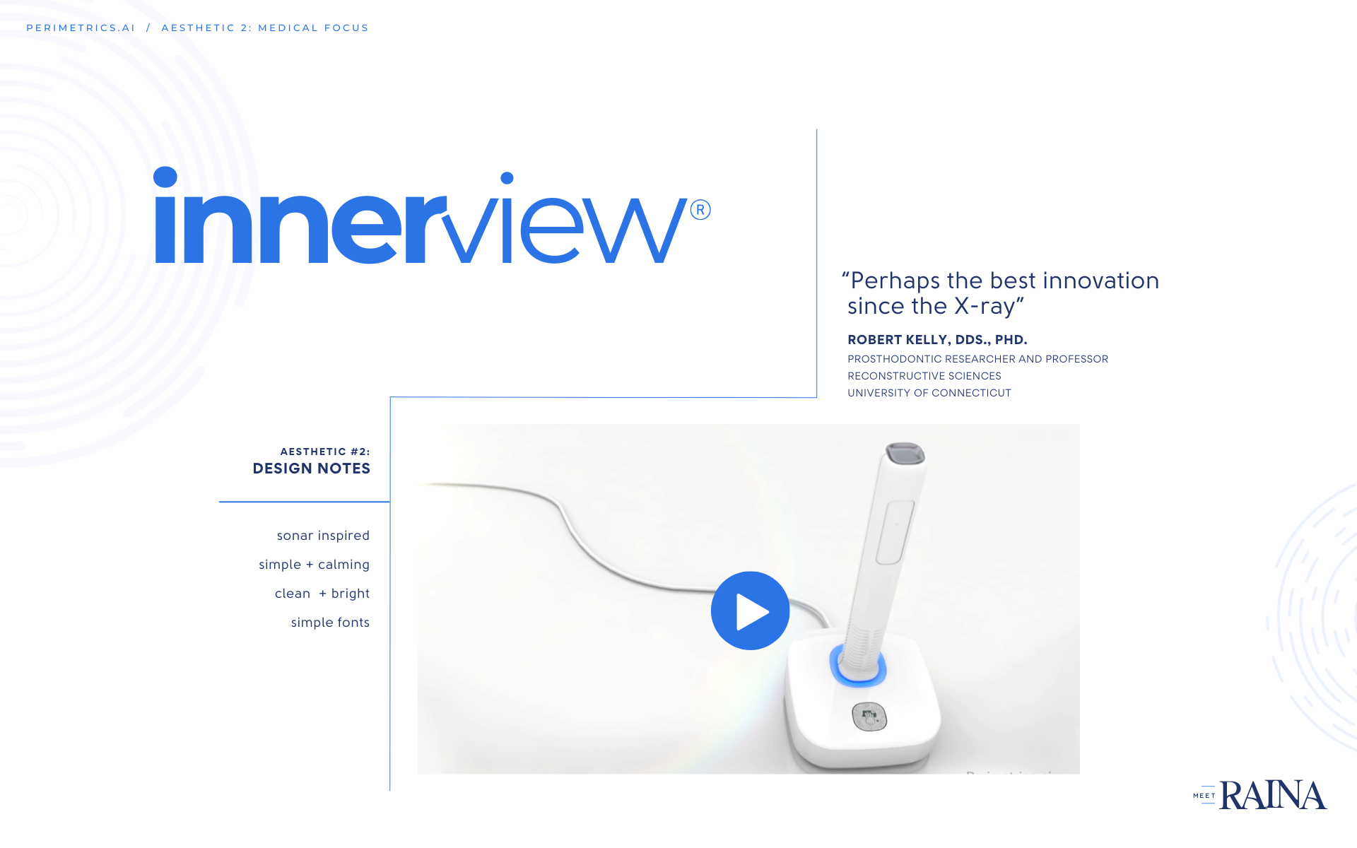
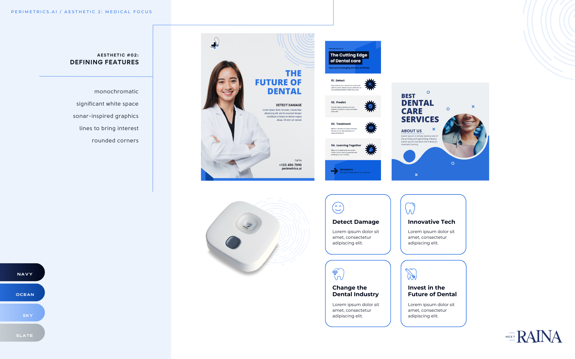
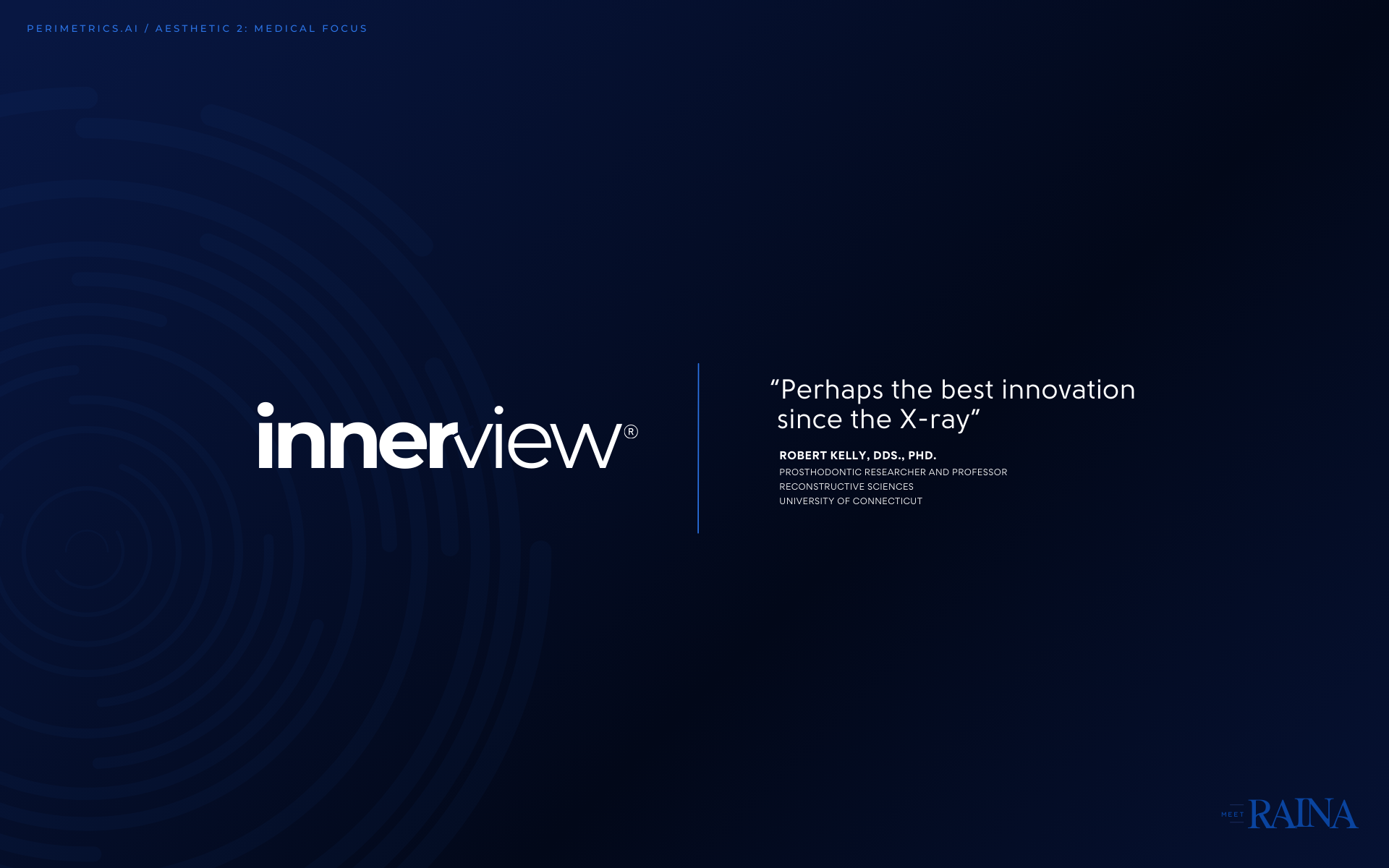
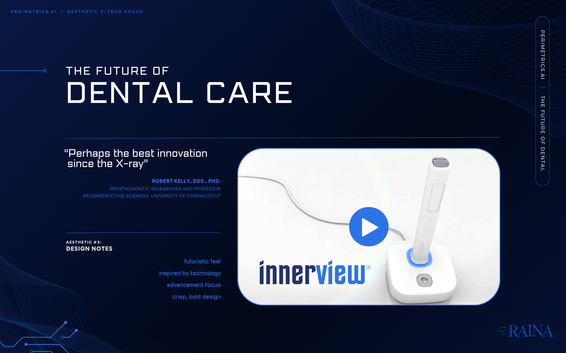
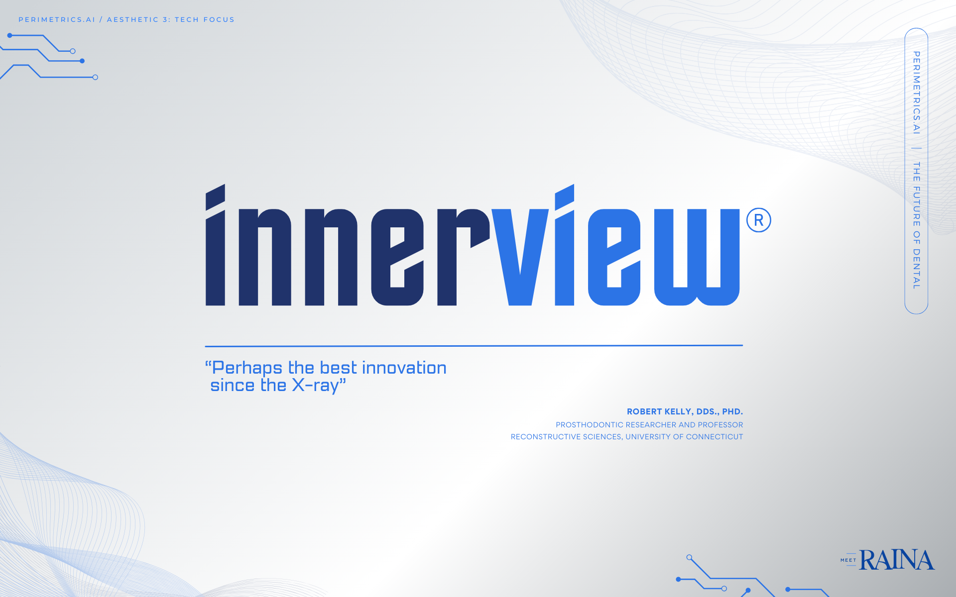
InnerView is the name of an invention created for the dental industry that uses ai and sound waves to create imaging previously impossible. The goal was to create a brand that was simultaneously professional and attractive to dentists, while playful and fresh for investors looking to find AI driven projects to back. Here is a look into our branding journey.
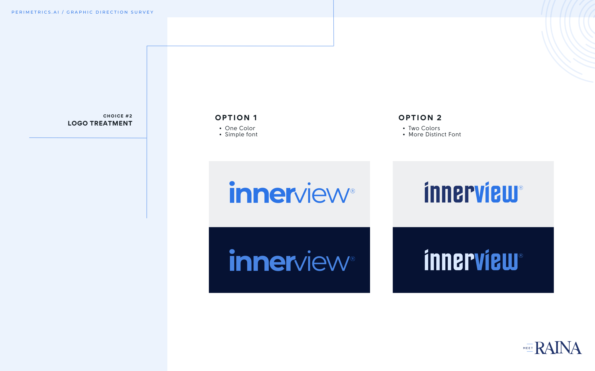
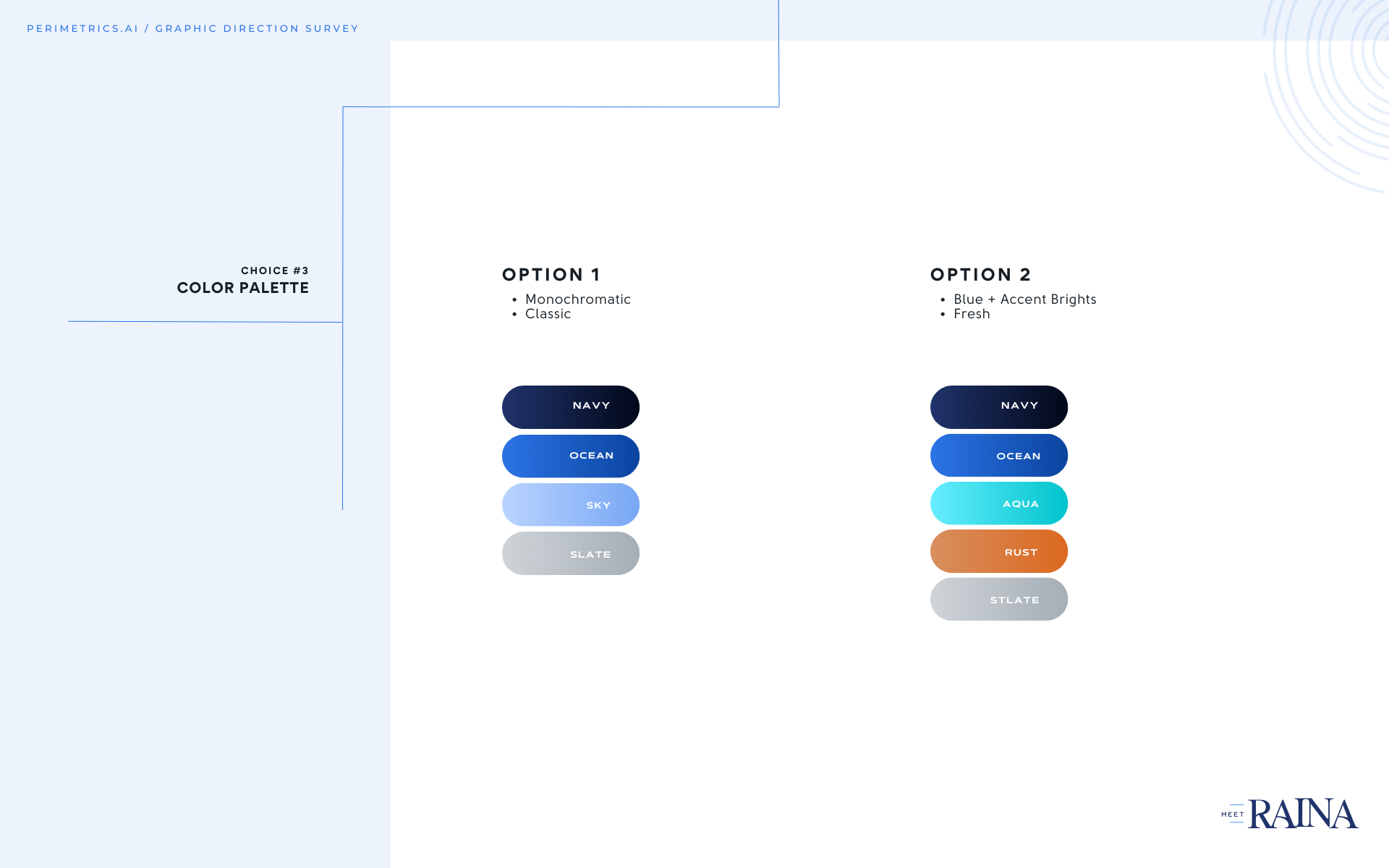
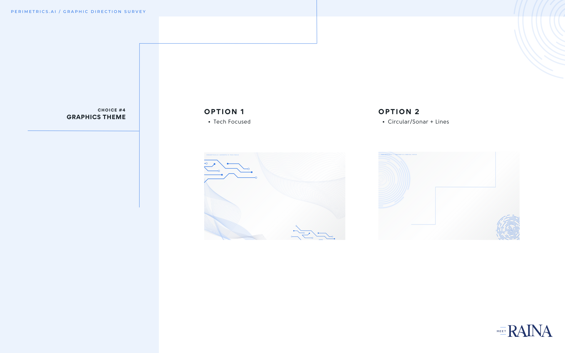
/ PHASE 1 /
Before settling on a logo, I created these 3 distinct options to visually articulate the brand direction into one of three different aesthetics. Each are customized to represent a viable market. The purpose of this exercise was to narrow down the brand with imagery, fonts, and photo treatment rather than with words for the approval process to be more cohesive and easy to understand before too much was invested into the project.
Aesthetic 1: Fresh Focus
Aesthetic 2: Medical Focus
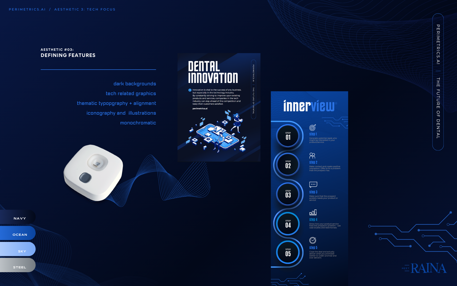
Aesthetic 3: Tech Focus
/ PHASE 2 /
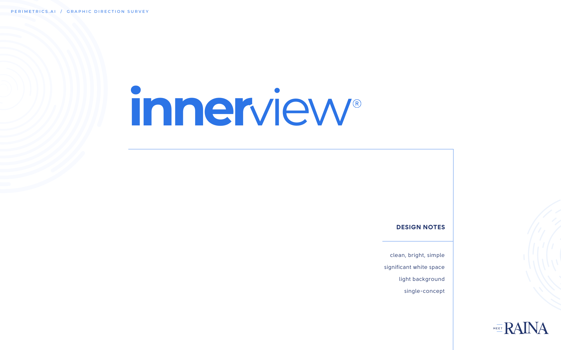
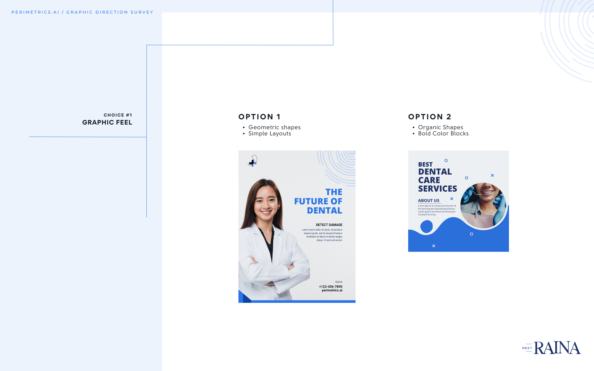
After viewing the 3 aesthetics above, the client chose “A combination of Aesthetic #2 and Aesthetic #3 that’s bright and simple.” With that direction, I created this Brand Discovery Questionnaire that visually showed the choices between different aspects of the aesthetics. This process allowed us to arrive at a hybrid look that would represent both the Medical and Tech aspect of the project.
Brand Discovery Questionnaire
Hunter Davisson / Event Booth


Radiant Nutrition / Brand System
Taking their existing logo, I updated the shape and fonts to create a more relevant look. I then created extended color palettes, font pairings, and image libraries for a cohesive system that represented their colorful, welcoming, approachable brand. I then made a custom pattern using elements from the logo to apply to additional graphics. The resulting brand system shows exactly how to apply the new look to future projects.


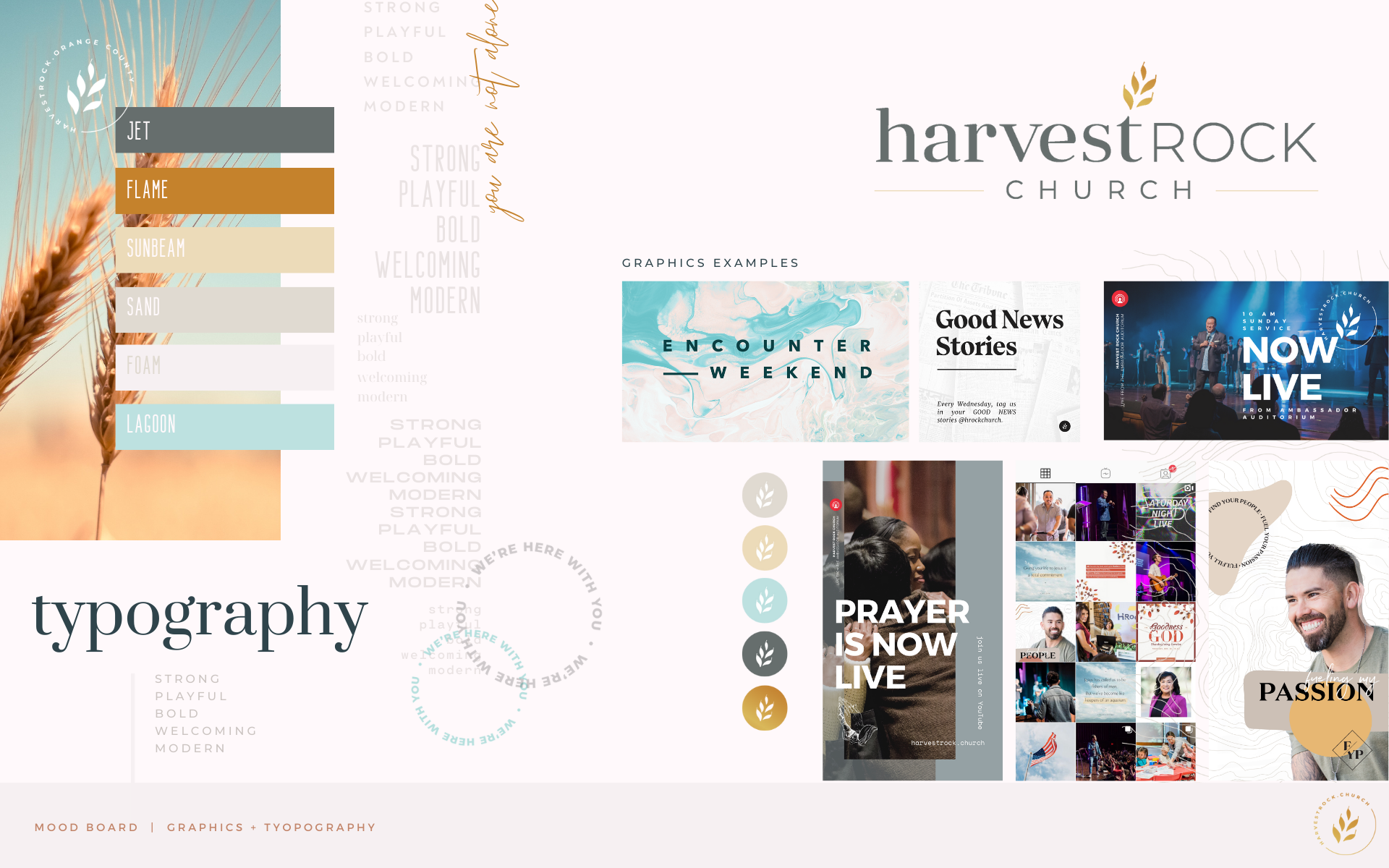
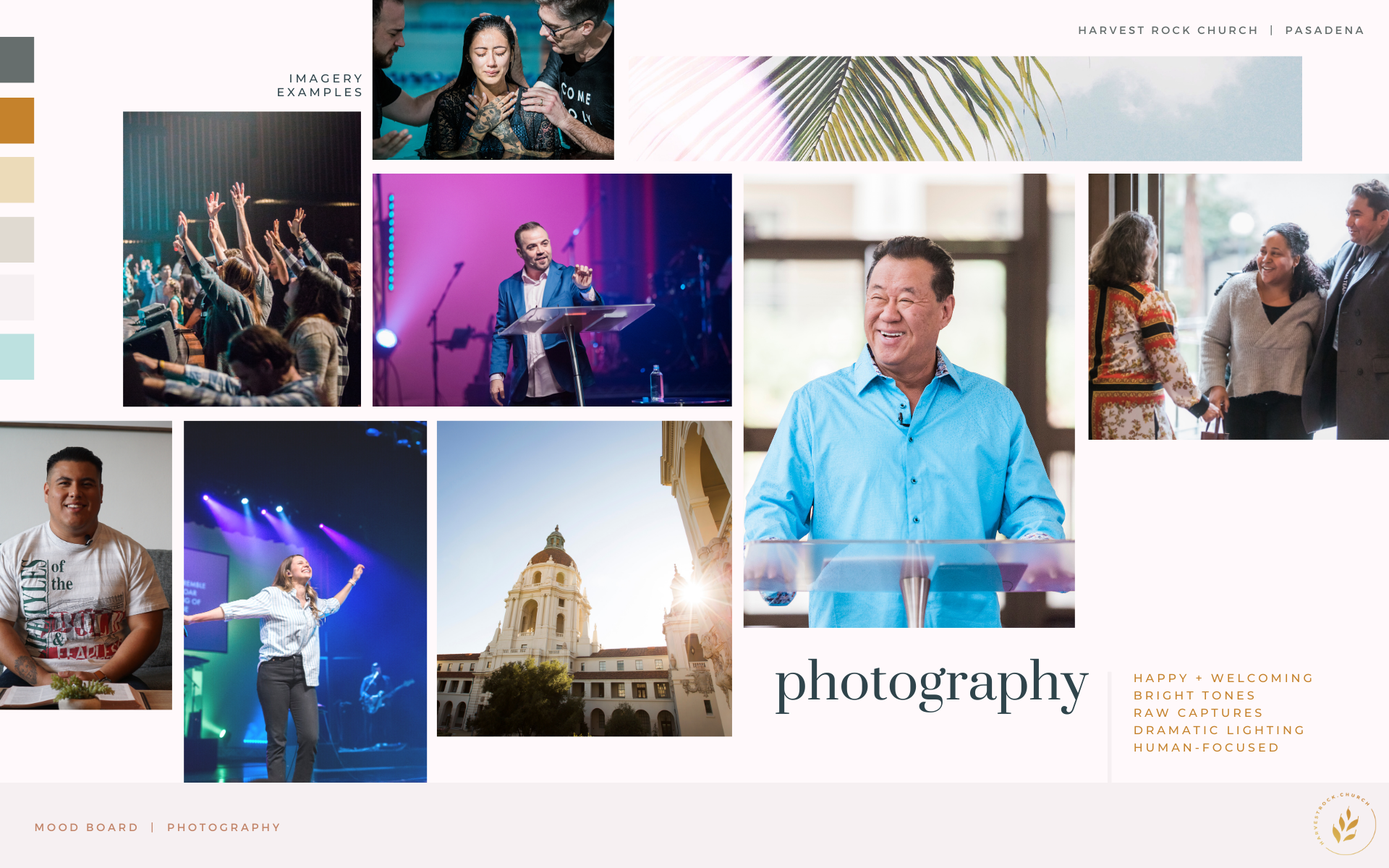
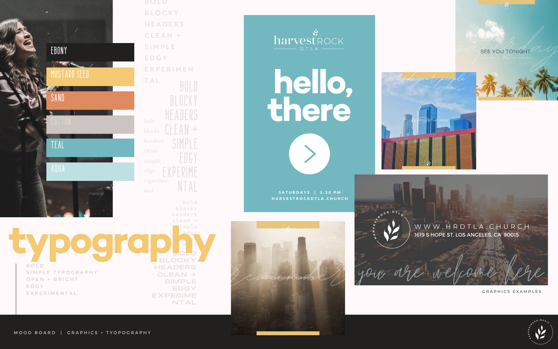
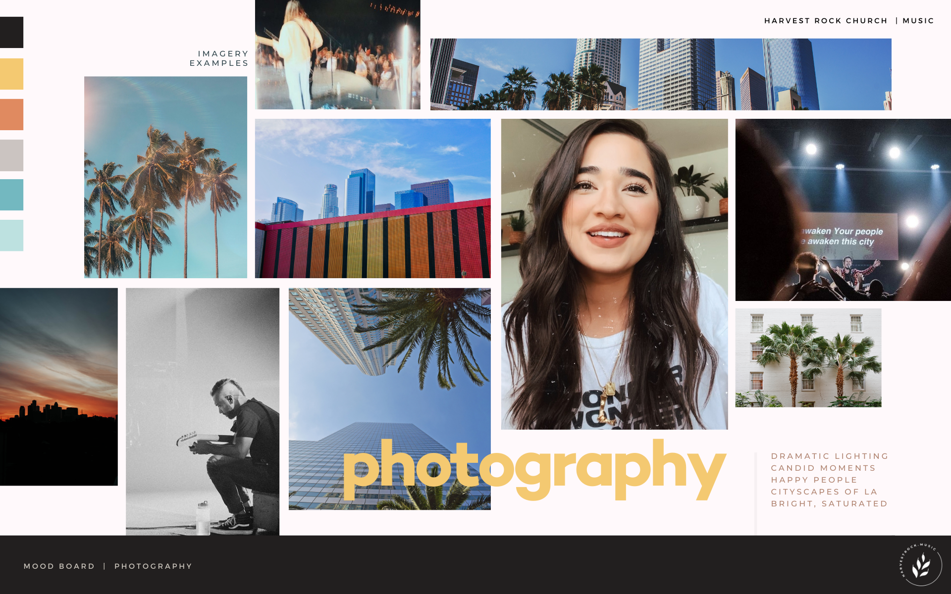
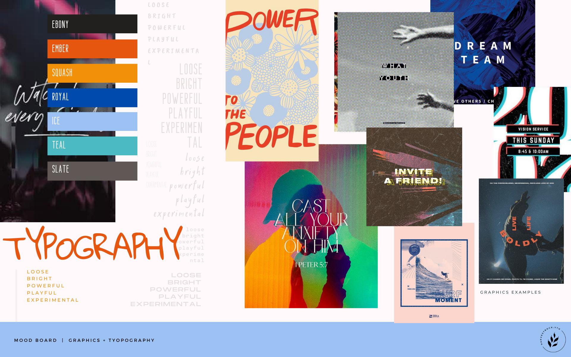
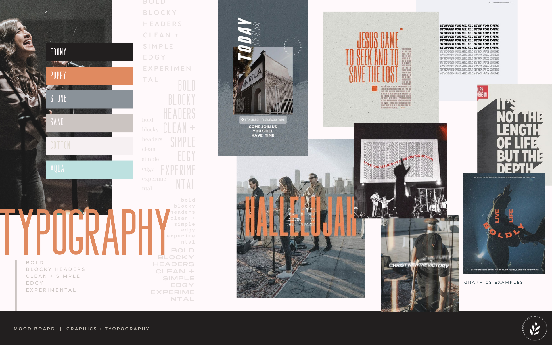
HRock / Location Brand Differentiation
Using the flagship location as the starting point, the objective of this project was to create a different, distinct vibe for each location. The brands would all present a cohesive look that represented the flagship location well, but that also reflected the culture of it’s demographic and geography. Each location came with notes to inspire the look, represented by a selection of fonts, colors, graphics, and imagery to set the tone.
/ The logos, brands, and mood boards represented below are created by me, but the graphics and photography were sourced from other creators /
Brand 0: Flagship Location / Mood: Harvest, Warm, Welcoming Southern California Vibes
Brand 1: Downtown Los Angeles / Mood: Urban, Colorful, Fresh, Southern California Vibes
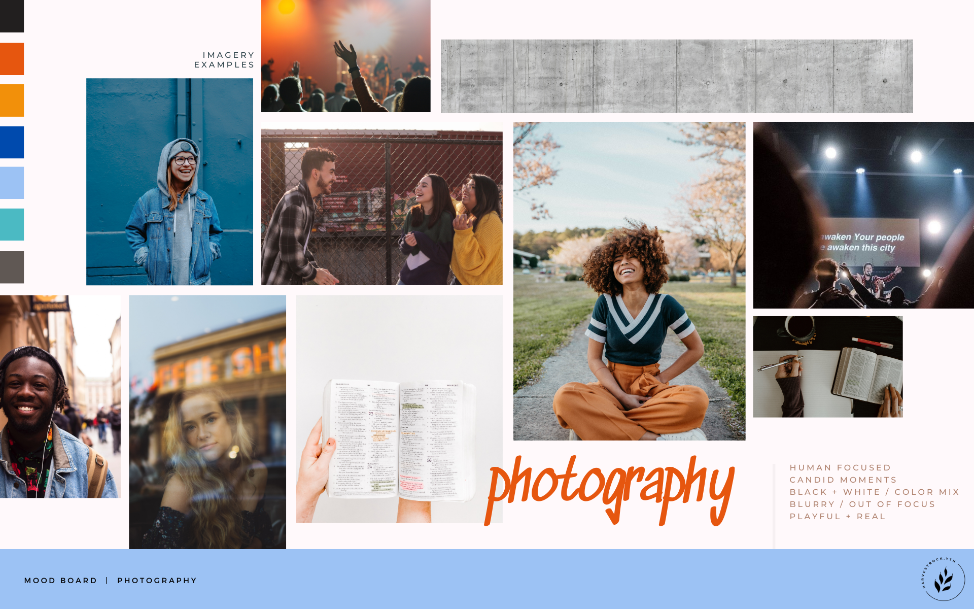
Brand 2: HRock.YTH / Mood: Young, Powerful, Edgy, Bold
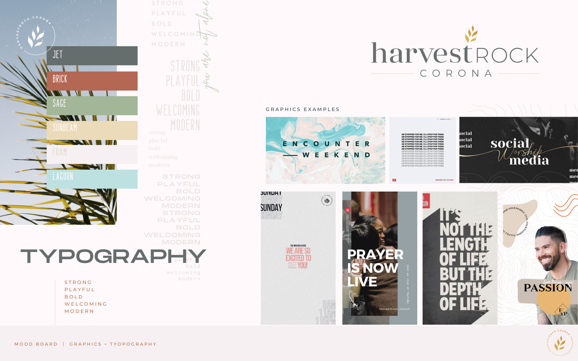
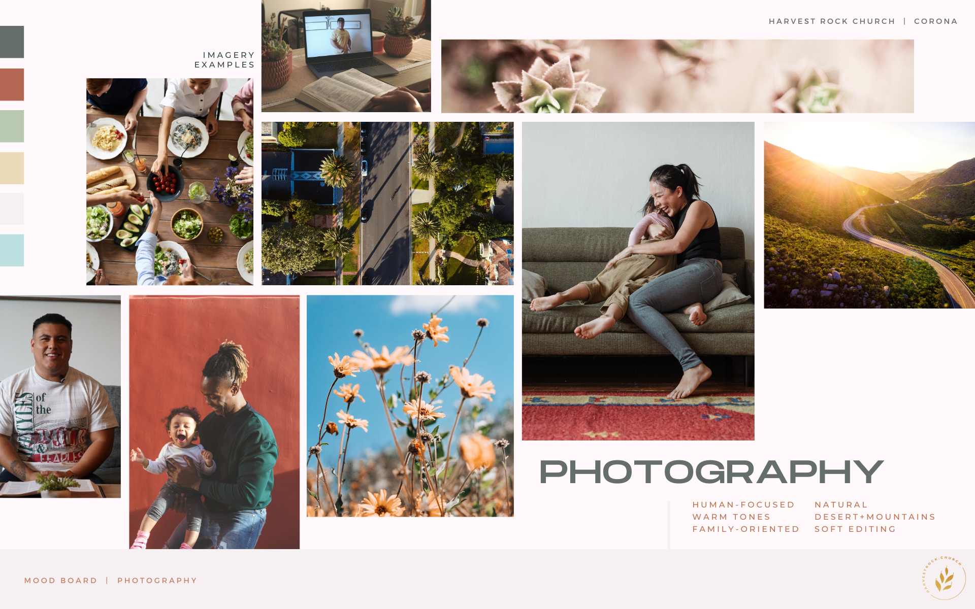
Brand 3: Corona / Mood: Elegant, Nature, Desert, Warm
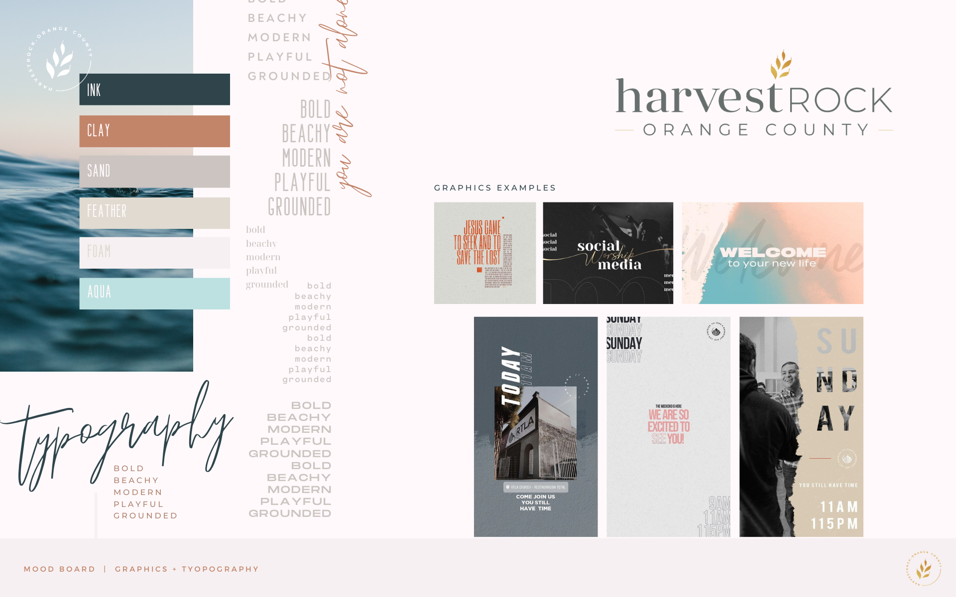
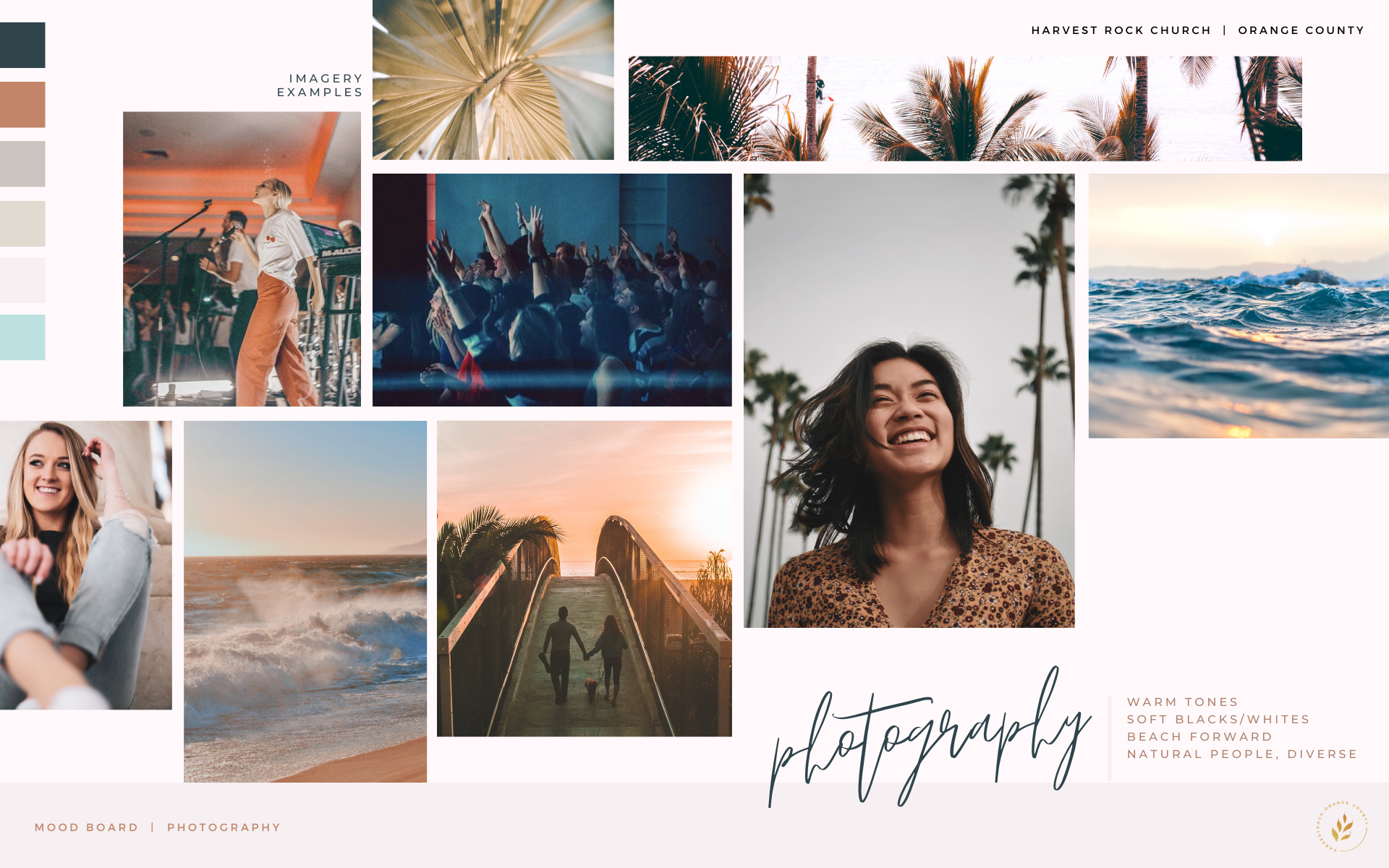
Brand 4: Orange County / Mood: Beachy, Light, Airy
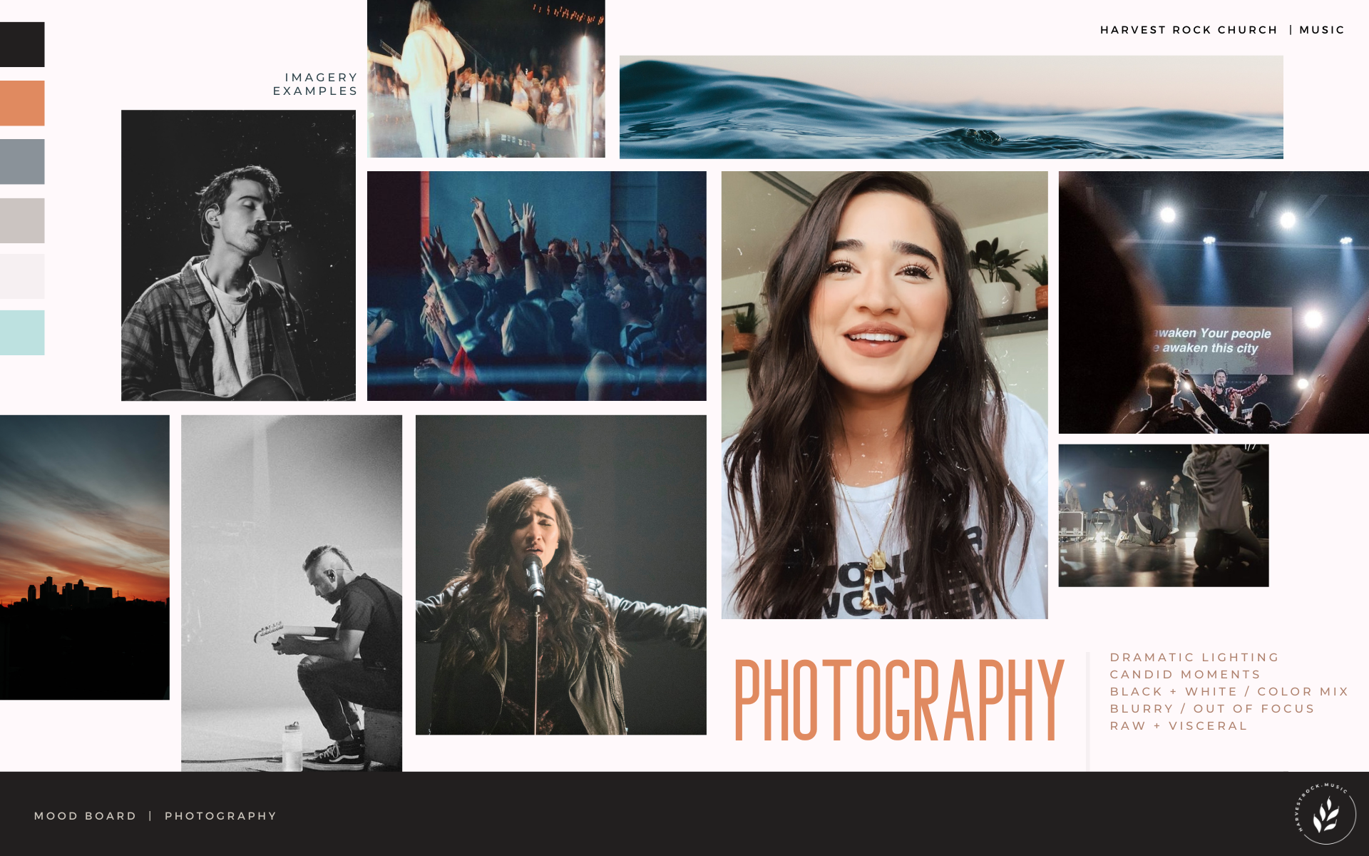
Brand 5: Music / Mood: Deep, Urban, Moody, Trendy
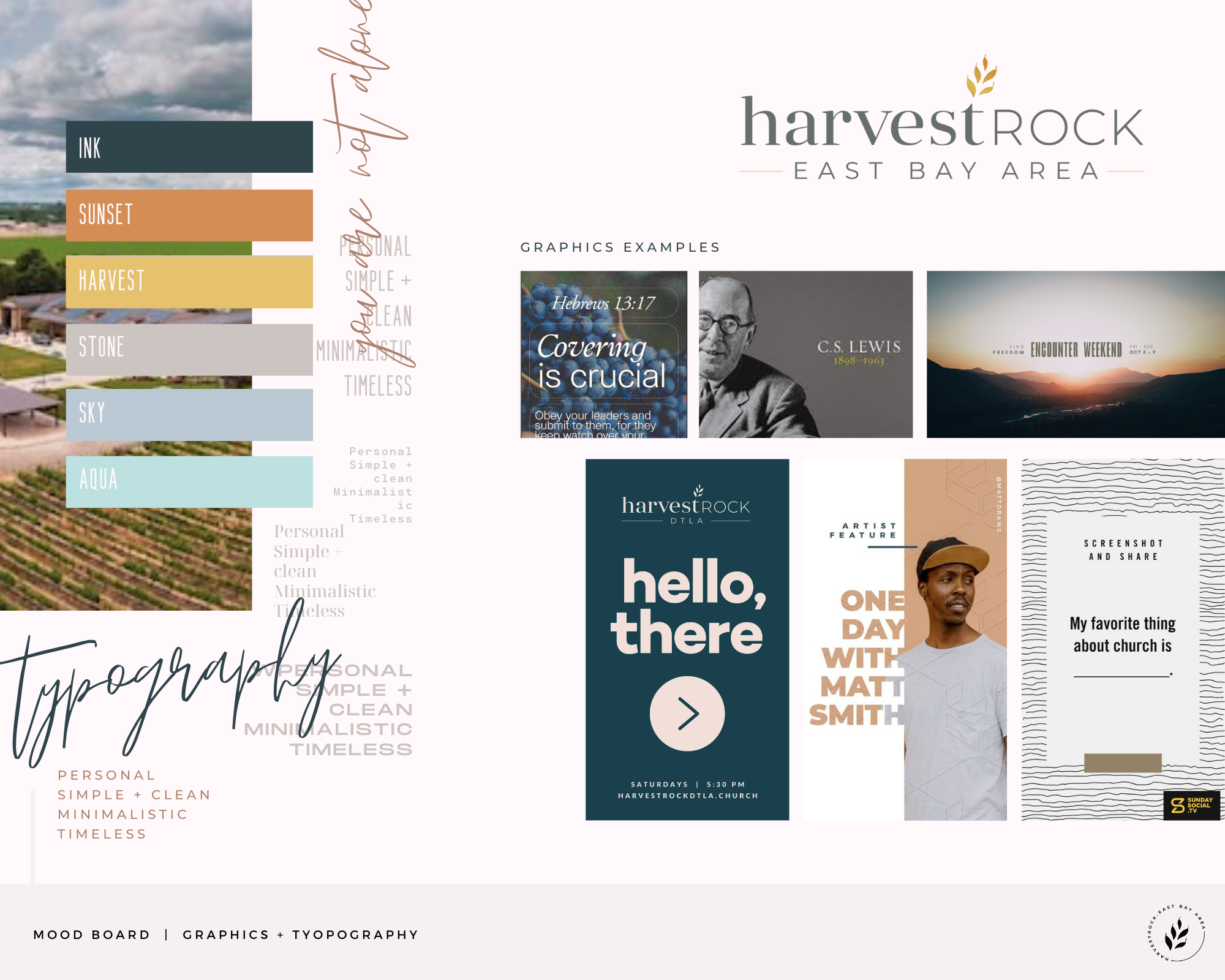
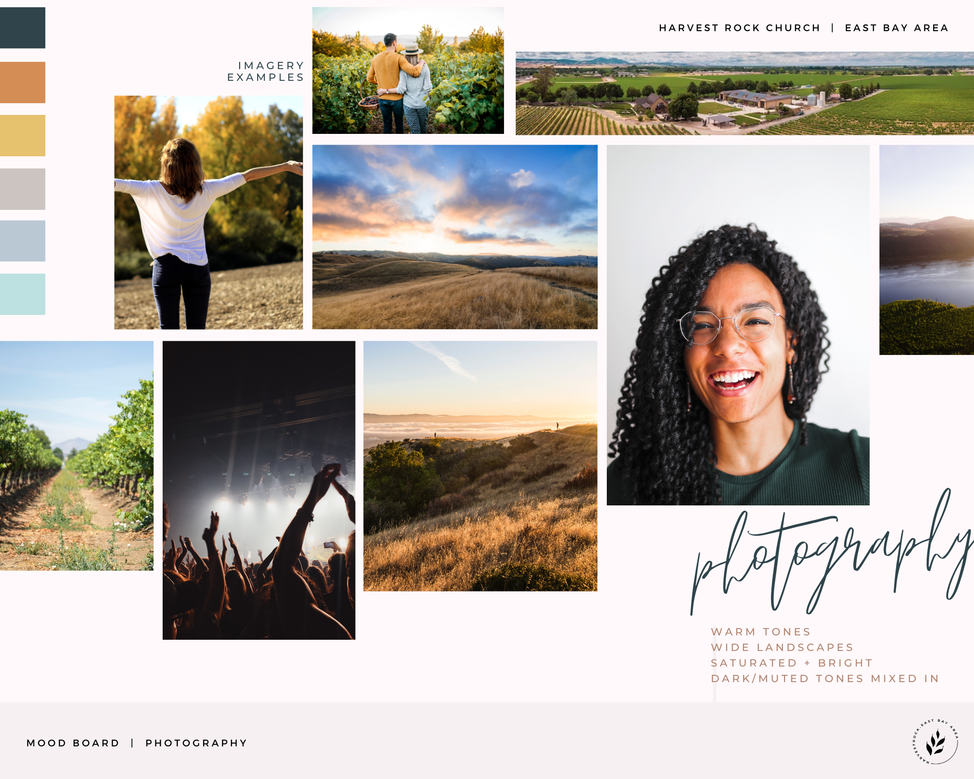
Brand 6: East Bay Area / Mood: Wine-Country, Sunset, Mature
Alive IV and Wellness / Print Brochure


Radiant Nutrition / Brand System
The only thing this electric company had going for it was their logo shape. The colors, typography, and image usage stole dramatically from the strength of their brand. Rather than recommend a complete rebrand, I took their current logo and made a white and icon version, updated the colors, and selected more fresh font pairings. Then I created an image library to visually describe the types of imagery to use for their brand. Here is the result.


